
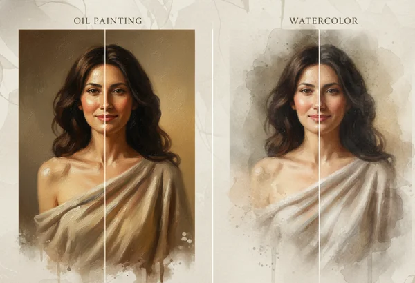
Oil Painting vs Watercolor for Your Photo
Why oil painting and watercolor create different moods from the same photo
The same photo can feel bold in one style, then soft in another. That is why style choice matters before download, not after it.
Oil painting and watercolor often attract the same user for different reasons. One promises richer texture and stronger visual weight. The other feels lighter, calmer, and more open. If the photo already has a clear subject and a strong use case, style choice often matters more than small edits to the source image.
The easiest way to compare them is inside a photo to painting workflow. You can upload once, preview different looks, and judge the mood before you save the file. That approach fits the platform's core promise: simple style selection, fast generation, and a digital artwork you can download for your own later use.
What each style tends to emphasize in a photo
What gives oil painting its richer, more textured feel
Oil-painting looks usually work best when the photo has structure. The National Gallery of Art painting lesson for grades 6-12 says palette knives can build paint up quickly and create textured effects that range from smooth to rough. That is a useful reference point for AI style choice. Photos with clear edges, visible fabric, hair detail, or layered backgrounds often look stronger when the generated style can lean into surface texture.
Oil style also works well when the image needs visual weight. Rich shadows, stronger color blocks, and more obvious brush energy can make a portrait or pet photo feel more formal. The National Gallery's texture resource notes that oil paint can be applied in thin layers and then smoothed while still wet. That helps explain why oil-inspired outputs can hold both texture and blended transitions at the same time.
What makes watercolor feel lighter and more atmospheric
Watercolor usually flatters photos that already feel soft, open, or nostalgic. A Smithsonian watercolor description says watercolor washes retain the rough texture of paper, show darker tones where pigment gathers, disperse into lighter hues, and keep edges soft yet still defined. That mix gives watercolor-style outputs a lighter mood than oil, even when both start from the same source image.
The same Smithsonian description notes that the Watercolor Maptiles project launched in 2012. That detail matters less than the visual principle behind it: watercolor effects still depend on uneven washes, soft transitions, and breathable negative space. When a photo has gentle light, calm scenery, or personal value, watercolor often preserves that mood without making the image feel too heavy.
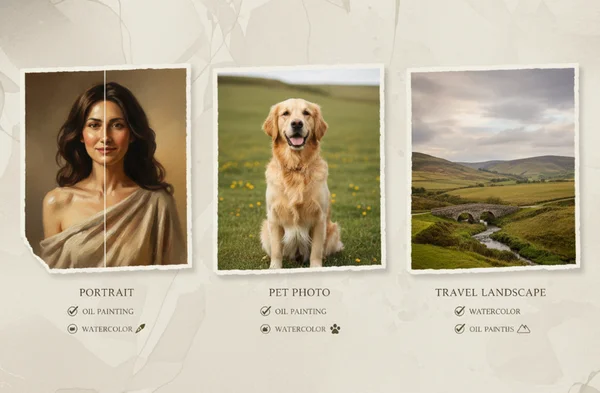
Which photo subjects fit each style best
Portraits, pets, and close subjects
Oil painting often wins when the subject needs presence. A close portrait with strong eye contact, textured clothing, or a detailed pet coat can benefit from the richer surface feel and firmer shape definition. If the goal is a statement piece, oil usually gives the subject more authority.
Watercolor can still work beautifully for portraits and pets, but it tends to soften the result. That is often better for family memories, children's photos, or pet images where warmth matters more than dramatic detail. If the original photo already feels tender or playful, watercolor may keep that emotional tone more naturally.
Landscapes, travel shots, and memory photos
Watercolor often suits landscapes and travel scenes because it handles atmosphere so well. Sky gradients, mist, water reflections, and soft tree lines all benefit from a style that lets color drift and edges breathe. A travel photo meant to feel dreamy or reflective often looks more natural in watercolor.
Oil painting becomes stronger when the landscape has bold contrast or strong foreground detail. City streets, mountain ridges, textured buildings, and sunset scenes with clear shape separation can hold up well in oil because the style has more visual mass. For memory photos, the question is simple: do you want a soft memory or a stronger visual statement?
How lighting, detail, and background clutter change the result
When strong detail helps oil painting more
Oil painting usually benefits from cleaner structure in the source image. Sharp eyes, clear outlines, layered clothing, textured fur, architectural detail, and visible depth give the style more to work with. If the background is busy, oil can still succeed, but it usually looks best when the main subject is clearly separated from the clutter.
This is where preview matters. A style preview tool can show whether the extra texture is helping the subject stand out or simply making the frame feel crowded. If the generated image starts to look too dense, the photo may need a simpler crop or a lighter style.
When softer scenes suit watercolor better
Watercolor usually handles gentle light and lower visual pressure more gracefully. Side-lit portraits, soft family photos, spring gardens, shoreline scenes, and quiet interiors often benefit from the way watercolor relaxes edges and spreads attention across the frame. This can also help when the original photo feels emotionally important but visually ordinary.
Watercolor is also a strong rescue choice when the background is not perfect. It will not fix a bad source image, but it can make moderate clutter feel less aggressive than oil does. If the photo has a clear subject but slightly messy surroundings, watercolor often produces a cleaner emotional result.
How to decide based on your final use case
When to choose oil painting for bold display
Choose oil when the goal is impact. It is a strong fit for hero portraits, pet tributes, statement wall pieces, and gifts where the subject should feel vivid and substantial. If you want the final download to feel closer to a centerpiece than a soft memory piece, oil is usually the better first test.
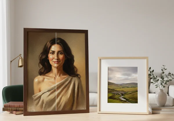
Oil is also the safer choice when the room or display context needs contrast. Darker furniture, neutral walls, and larger frames often pair well with stronger edges and deeper color weight. After download, any printing or framing decisions still happen outside the platform. The right move is to pick the style that gives the digital file the clearest visual identity first.
When to choose watercolor for a softer mood
Choose watercolor when the goal is warmth, lightness, or calm. It works well for family keepsakes, gentle landscapes, travel memories, and gifts that should feel intimate rather than dramatic. If the result is meant to look elegant, airy, or quietly personal, watercolor usually gets there faster.
Watercolor also fits users who want a more forgiving style. It can make everyday photos feel more artistic without demanding perfect detail in every corner. In a painting style comparison, watercolor is often the better match when the emotion matters more than fine structure.
What to do next before you download your painting
Start with the photo's job. If the image needs presence, texture, and stronger visual weight, test oil first. If it needs softness, atmosphere, and a more relaxed mood, test watercolor first.
Then compare both previews with the same standard. Check the subject's clarity, the background mood, the color balance, and how natural the style feels for the memory you want to keep. A digital art preview is most useful when it helps you choose the look that fits the photo, not just the trendiest filter.
The best final choice is usually the one that matches the subject, the mood, and the use case at the same time. When those three pieces align, the download feels intentional instead of random.