Refined and Realistic
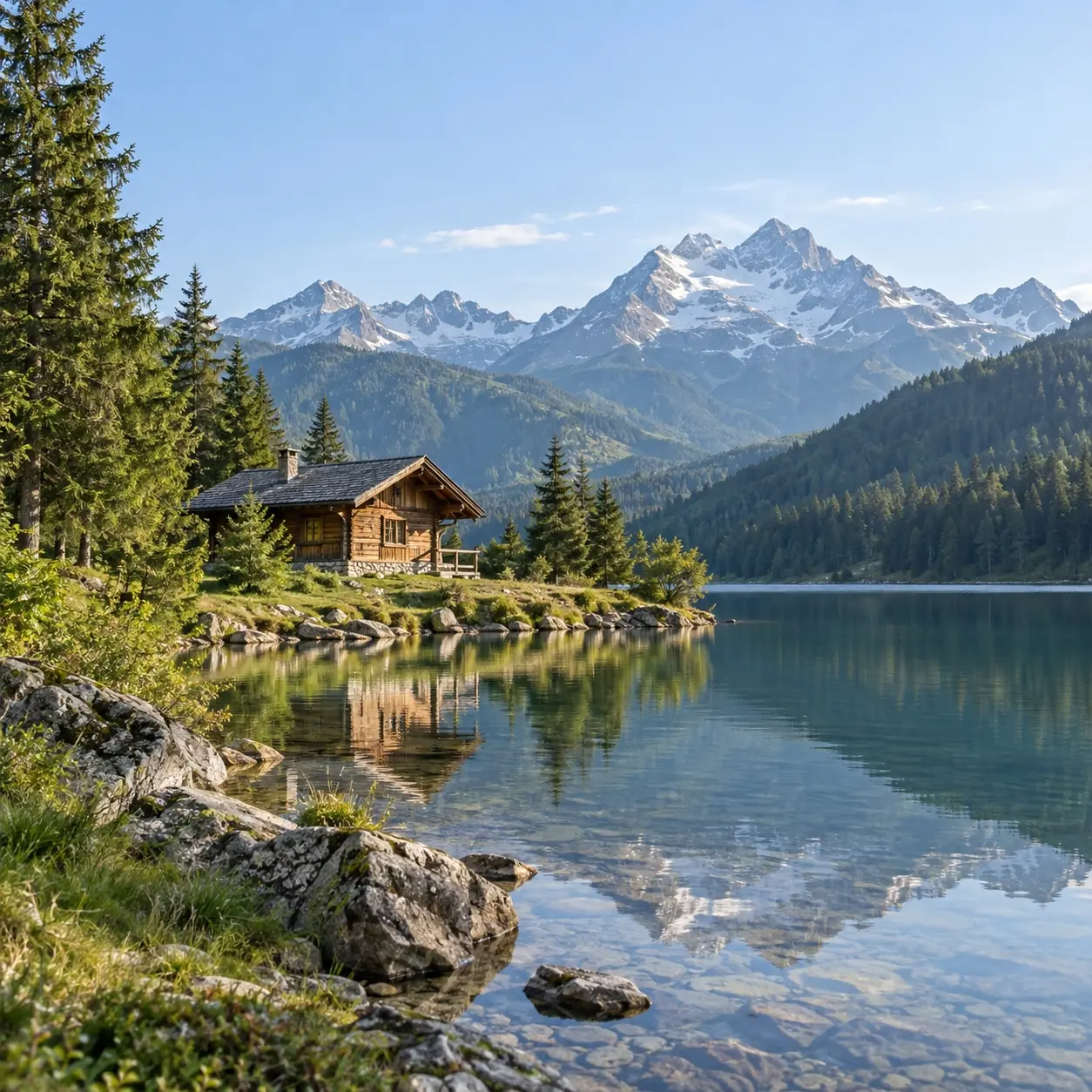
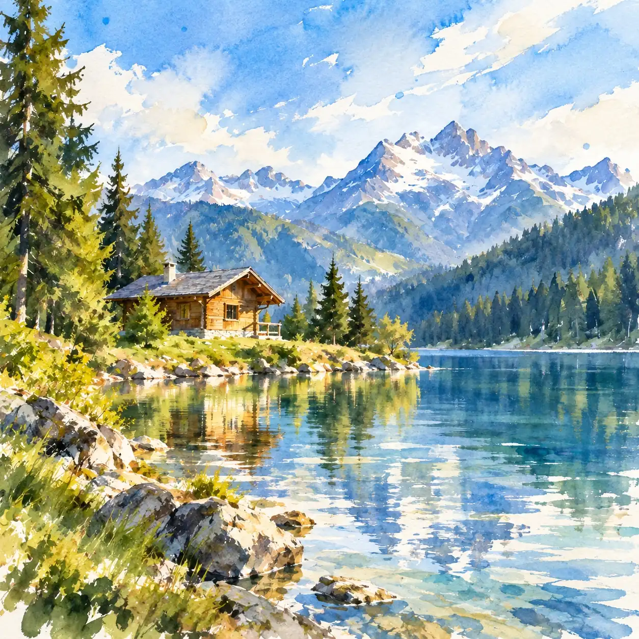
Try Refined Realistic for softly blended tones and restrained brush marks. It is a starting point when you prefer careful forms over conspicuous paint texture.
Quiet brushwork, broken color, or bold strokes: pick a direction that suits the feeling of your photo.
Try Refined Realistic for softly blended tones and restrained brush marks. It is a starting point when you prefer careful forms over conspicuous paint texture.
Explore broad brushwork and the appearance of built-up paint. Try this look when the movement of the strokes matters as much as the subject.
Try Impressionist for short strokes and touches of warm and cool color. It may suit a scene whose appeal comes from changing light or atmosphere.
Choose Classical Chiaroscuro to explore a more dramatic balance of illuminated and shaded areas. Try a photo that already has a distinct source of light.
Try Expressionist when you want forceful strokes and bolder color contrasts. This direction gives you room to explore mood beyond the photograph’s original palette.
Explore gentle transitions and quieter edges with Soft Atmospheric. Try it when you want a subdued painted look without the prominent ridges of impasto.
Start with an image whose subject is easy to see. Choose from multiple output aspect ratios to suit the composition you have in mind.
Select the oil treatment you want to try and sign in to generate. Oil-style generations use credits; check the estimate on Generate first. No written prompt is needed.
Compare the result with your original for subject likeness and framing. Download it when you have a version you want to keep.
Look at the image as a whole. The main subject should still draw your eye, and areas of light and dark should form a readable composition.
Look at how strokes describe a face, fur, foliage, or other surfaces in your photo. Judge whether the marks help explain the form or make it harder to read.
Inspect where the subject meets its surroundings. Soft edges may add atmosphere, but important outlines should remain clear enough for your purpose.
Brushwork, source photos, and the difference between a digital oil effect and physical paint.
It may resemble a photograph of an oil painting, with suggested brush marks and layers of color. The resemblance varies by style and source photo. The result is a digital image: it contains no physical paint and is not a hand-painted commission.
Start with visible light and shadow and clearly separated shapes. A landscape, building, or still life can be worth trying. Heavy blur or deep shadows that hide the subject give the painted interpretation less useful detail to work from.
Try a photo with the eyes in focus and a clearly visible expression. Distinctive hair, ears, or coat markings can matter more to recognition than every strand of fur. AI may alter these features, so check them carefully if likeness is your priority.
Not exactly. An oil treatment may shift warmth, saturation, and shadow colors. If a particular color is essential—such as a pet’s coat or the color of an object—compare it with the source before using the image.
In physical painting, impasto refers to thick applications of paint that leave visible relief. In a digital image, highlights and shadows can suggest those ridges. The texture is part of the picture, so zooming in reveals pixels rather than a raised surface.
A soft oil look suggests blended layers of paint and gradual tonal changes. Watercolor is associated with transparent washes, exposed paper, and pigment spreading at wet edges. Both can feel delicate; softness alone does not make an image watercolor.
Try Classical Chiaroscuro for an older painted mood built around light, shadow, and warm earth colors. This is a stylistic direction, not an aging or historical reconstruction tool; do not expect period clothing or an authentically aged canvas.
They may change or become less legible as the image is reinterpreted through brushwork. Pay particular attention to writing on buildings, patterned clothing, jewelry, and other small features if they carry meaning in the photo.
Start with an oil-style digital image, then ask a separate print provider whether the file suits your intended canvas and size. Request a proof if available. A standard print reproduces the appearance of brushwork; it does not add actual strokes of oil paint.
A familiar scene may feel different in quiet blended tones or lively strokes. Choose the oil look you want to explore.