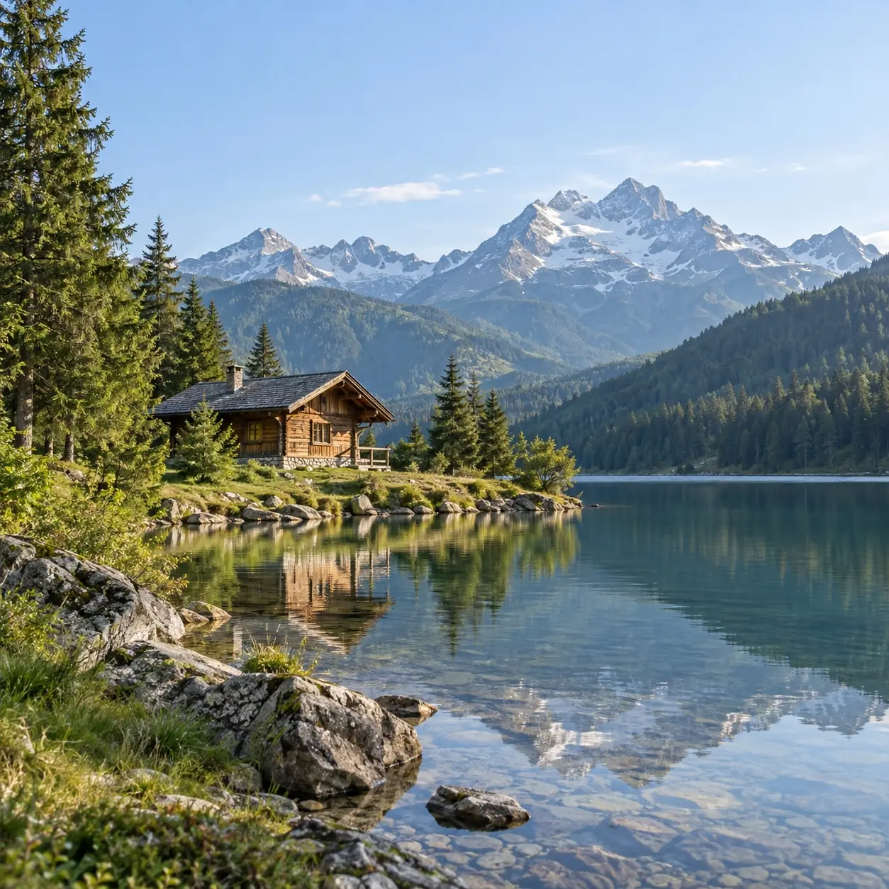
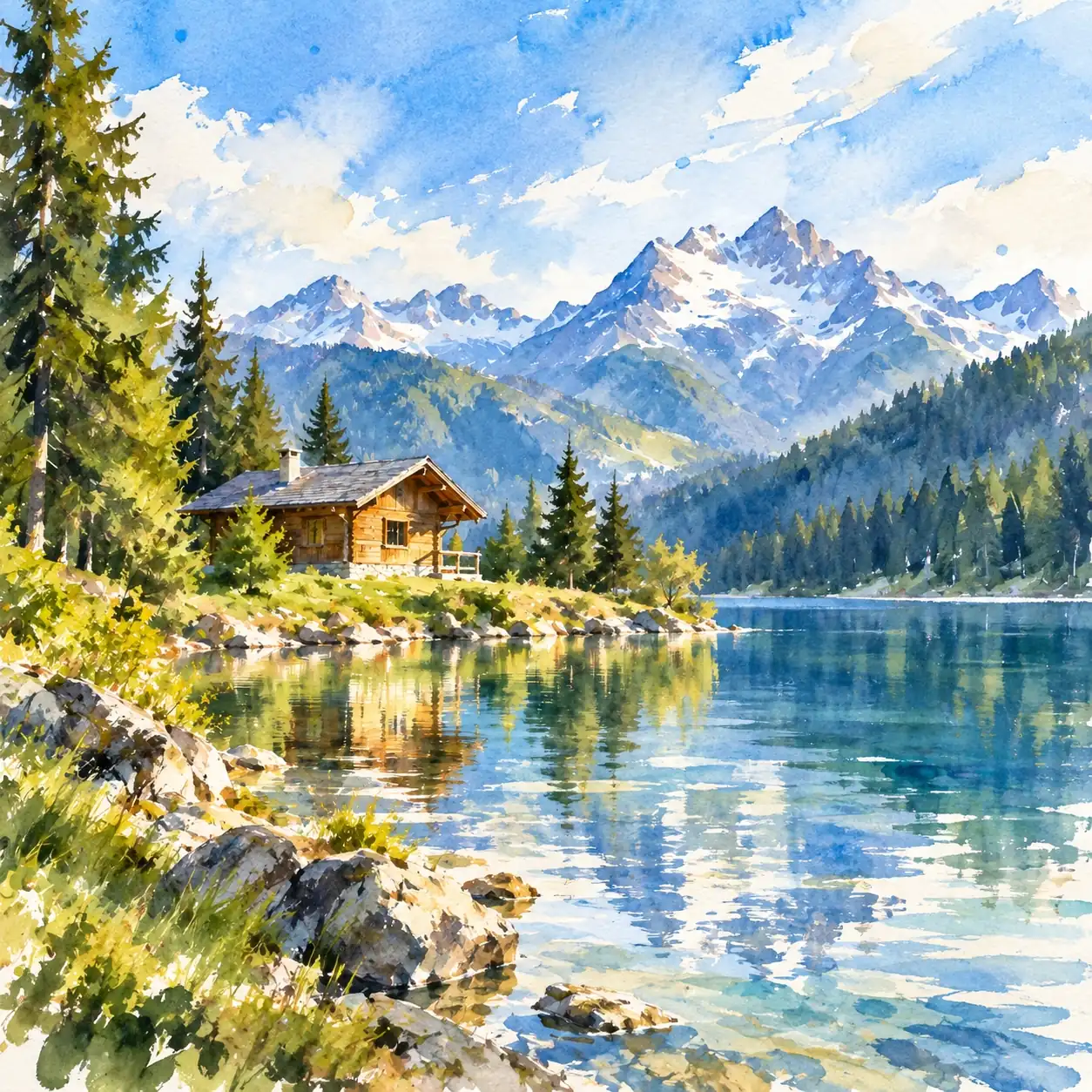
Playful Mixed Media
Try a picture-book feel with watercolor, restrained gouache, and pencil-like touches. Uneven edges and small gaps between line and color are part of this relaxed direction.
Try playful mixed media, delicate keepsake washes, or a loose memory impression. Each offers a different balance of color, line, and paper.
Try a picture-book feel with watercolor, restrained gouache, and pencil-like touches. Uneven edges and small gaps between line and color are part of this relaxed direction.
For a lighter mood, explore thin transparent color and an ivory-paper feel. This style favors a small palette drawn from your photo and fine detail near the focal point.
Try a few pooled color stains with casual blue or blue-violet pen marks. This direction leaves more unsaid, using distinctive shapes and colors to suggest the scene.
Light areas give airy washes space to breathe. A photo with visible highlights may offer a useful starting point; a heavily shadowed source may feel less delicate.
A flower, a familiar street, or a simple still life may suit these illustration styles. Distinct color areas give you something to work with when small textures are simplified.
A loose impression may suit a memory better than a literal record. If a tiny inscription, exact expression, or intricate pattern is essential, keep the original photo alongside the artwork.
Try a photo with the face or animal in focus and important features visible. You can choose from multiple output aspect ratios; leave room around the subject.
Pick a watercolor look and sign in to generate; no written prompt is needed. Each watercolor experiment uses credits, with an estimate shown on Generate.
Inspect the eyes, mouth or muzzle, and distinctive markings. Check how softened details affect recognition, then download the result you want to keep.
Check whether pale washes and exposed-paper effects leave the focal point easy to see. A faint subject may get lost among similarly light surroundings.
Look where colors pool, overlap, or extend beyond an outline. Decide whether those loose edges add to the mood or obscure a shape you wanted to keep.
View the image small enough to take in the whole composition. See whether the main color groups still distinguish a flower from foliage, a building from sky, or an object from its surroundings.
Choosing a watercolor look, keeping a likeness, and taking a digital image to paper.
The delicate keepsake look borrows the light washes of a small illustration. It is a painting style, not a ticket or card template with perforations, numbering, or decorative borders.
Yes. AI can reinterpret the photograph as areas of transparent-looking color, softened edges, and paper-like texture. These effects are part of a digital image; no physical paper or pigment is involved.
Try a subject with distinct color areas and light that leaves its important shapes visible. An uncluttered arrangement may suit the delicate-wash style, while a colorful scene may be worth trying in mixed media. Dark, blurred, or overexposed areas give the illustration less information to draw on.
Try a portrait with a visible expression. Delicate washes may suit a gentler treatment, while the loose memory style intentionally reduces facial detail to a few cues. Eyes, mouth, and face shape can change, so exact likeness is not guaranteed.
You can try a pet photo that clearly shows the ears, muzzle, eyes, and distinctive coat patches. In these simplified watercolor looks, color patches and silhouette may carry more of the likeness than individual hairs. Small markings may be omitted.
Download the image and ask your chosen printer whether its pixel dimensions suit the size you have in mind. For these pale washes and paper-like textures, a small proof can help you judge how the colors appear on your chosen stock. Printing is a separate step.
Small textures and background details may be simplified or omitted. The loose memory look uses incomplete contours and unpainted gaps, while delicate washes put more emphasis on fine accents near the focal point. Keep the source photo if those details need to remain exact.
Two of the available looks deliberately combine media. The playful illustration uses pencil-like and wax-like touches alongside watercolor and gouache; the memory look pairs wet color stains with blue or blue-violet pen marks. Try the delicate-wash style if you prefer the emphasis on transparent color.
A familiar face, place, or object may tell a different story in delicate washes or a few loose marks. Try the watercolor mood that feels closest to your memory.